 |
| Top Ten Tuesday is a weekly meme hosted by The Broke and the Bookish |
Today's Top Ten Tuesday topic: Top 10 Covers I Wish I Could Redesign. Let's pull out the old books, shall we? Some of these may have already been redesigned and I just don't know it. But chances are, I don't like the new covers, either. :-)

We all know how much I hate staring covers, and books with staring men are probably the most annoying.
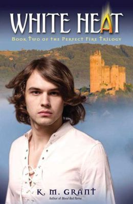
I cannot even begin to express how much I hate this cover! It is sooooooooo misleading! This is a terrific historical fiction trilogy, and this makes it look like a bodice ripper or Highland romance!
More staring . . . . I hate staring covers.

Lippy covers! And bosomy covers! I dislike these as much as staring covers; makes them look like teen Harlequin romances. Bleh.

Another totally misleading cover. This isn't a bodice-ripper! It isn't even a romance! It's very Dickensian, funny, and quirky. Never would have known that from the cover art, would you?

Possibly one of the world's worst covers, and I mean that with all my heart. Justin Bieber meets the Victorian era! How about not? I wouldn't have touched this if it hadn't been a trusted friend's assurance that it wasn't as bad as it looked.

This is another lippy, bosomy cover, and I hate it. Because of the cover, I was anticipating a horrible book, filled with chips on shoulders and bad dialogue. But it was actually really good.

It's a giant face, and it's also just kind of boring. Nothing like the book.

Just no.
It looks like another chick read, and while I wouldn't be recommending this to any of my guy friends, I wouldn't call it a chick read.
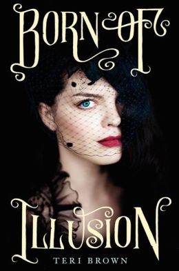
Haha, some of these are just boring. But I actually don't mind the cover to BORN OF ILLUSION--or maybe it's that I LOVE the font. The rest look like I could make them myself, and that's not a good thing.
ReplyDeleteRachel @ Beauty and the Bookshelf
Oh, I adore the font for BORN OF ILLUSION; I just don't like the staring face. Especially since it looks nothing how I imagined the protagonist.
DeletePalace of Mirrors is awful. I forgot all about that book.
ReplyDeleteThank goodness the book isn't as bad as the cover, right?
DeleteOh there are so many books I wish I could redesign the covers on (and sometimes I have for fun ;) I'm not a fan of staring covers either, however, I don't mind the guys so much as long as they are totally angsty and not all moony eyed like on Romance novels. Like if there's blood and swords involved, that's okay ;)
ReplyDeleteBlood and swords = cool. ;) Though Highland romances have men with swords - and sometimes blood - on them as well, and we all know how horrid Highland romances are.
Delete